Intro/
Trangia
This is some text inside of a div block.
Brief
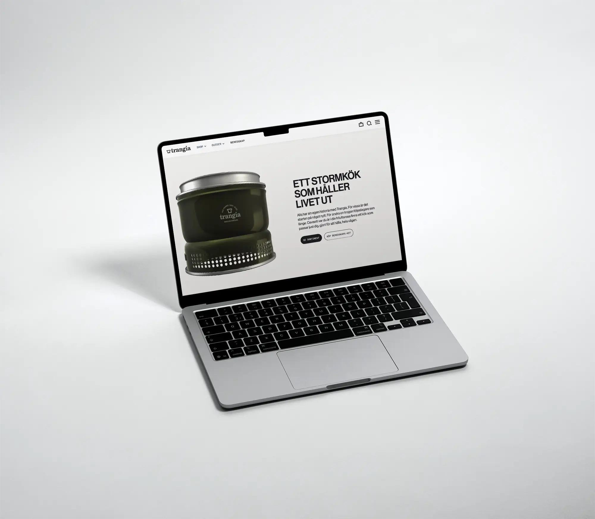
Trangia is an iconic Swedish brand known for robust, simple, and reliable camping stoves. Today, their stoves are used for outdoor adventures and emergency preparedness. Current communication targets experienced users, which can feel complex for beginners. The classic brand aims to reach a new audience while maintaining credibility with its existing users.
My role
I was responsible for the Webflow development and the UX/UI design of the product listing page (PLP) and the product page. I also modeled a 3D stove in Spline and integrated it into the website.
Year
2025
Duration
6 weeks
Project type
Fictional
Client
Brobygrafiska
Scope
Branding
UX/UI Design
E-Commerce
Webflow x Spline
Role
UX/UI Designer
Webflow Developer
Team
Johan Pettersson
Lina Andersson
Nathalie Åsberg
Juno Strömstedt
Understand/
Trangia
Emphatize
Getting to know the current brand and their customers
Started off with a deep dive into the brand’s current identity, user groups, and pain points on the existing website.
%%Defined personas%% representing the %%two target groups%%
Sketched up a %%sitemap%% of the current website structure
%%Heuristic analysis%% showed us some weak points and gave us intel to put together a user test
Conducted %%6 user tests%% on the current website. 3 persons representing from each target group. All tests ended with a %%user interview%%
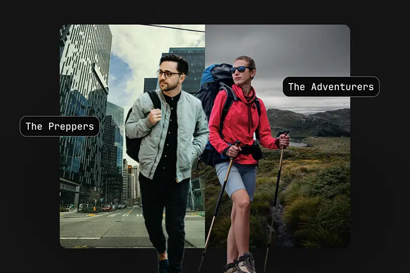
We defined the original target group as “The Adventurers” and introduced a new one- “The Preppers”. The Adventurers are experienced outdoor enthusiasts who likely already own a stove, while the Preppers are less focused on outdoor life but driven by the desire for security, independence, and preparedness.

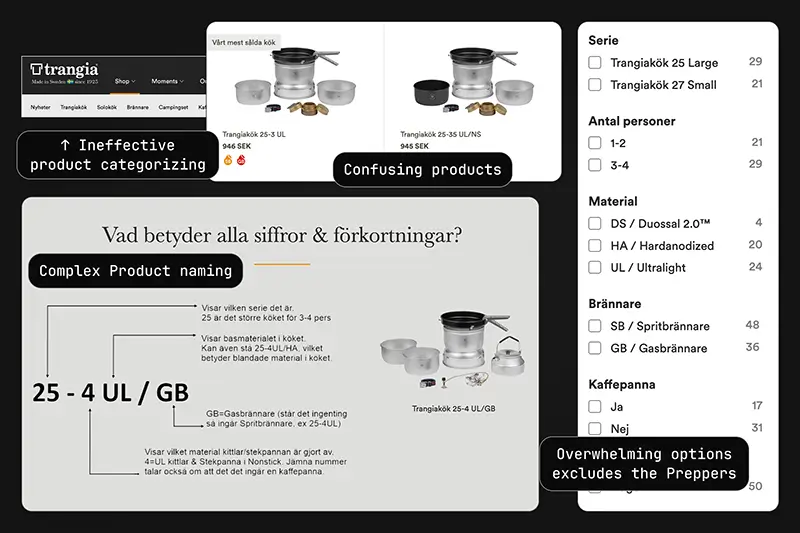
Heuristic evaluation and user testing showed that users struggled with navigation, filtering, and choosing between similar products. Clear signs that the site’s structure and product presentation were too complex for beginners. Interviews also revealed that Preppers were worried about safely handling fire and fuel.
Define
Defining the users pain points thru analysis
After testing with both target groups, it became clear that users felt overwhelmed by the number of options, which created confusion and frustration.
The user tests indicated us that %%both%% of our target groups %%having trouble with navigating, filtering and decision making%% on the site
Established 3 “%%How Might We%%” questions to frame the problem-solving process
We defined that Trangia needed to reach both Adventurers and Preppers. To achieve this, we identified the potential to simplify the tone, clarify navigation, and restructure the products.
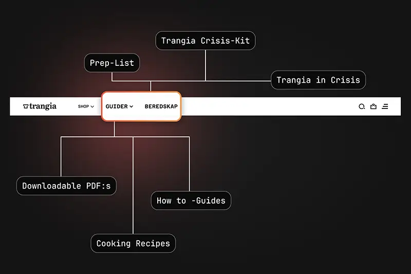
We also saw the need for a knowledge hub to reduce uncertainty around fire and fuel, addressing concerns raised by Preppers.
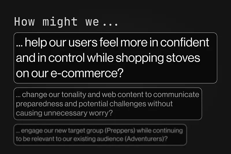
Insights from user tests allowed us to clearly define the pain points and establish the 3 key “How Might We” questions.
Explore/
Trangia
Ideate | Prototype
Turning our insights into design solutions
With our insights and HMW, we developed solutions to address key user pain points. The main solution was simplifying the core product.
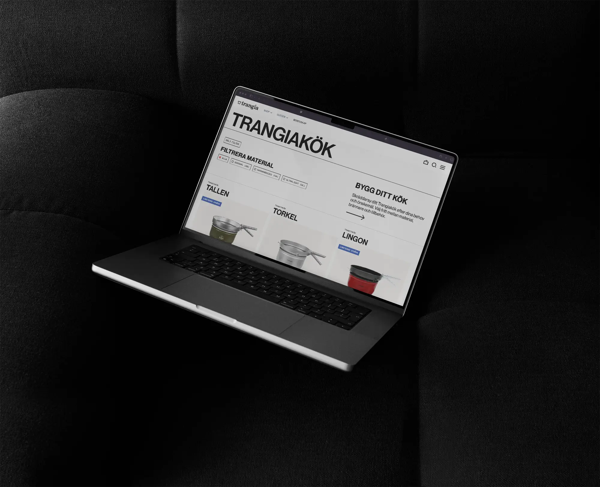
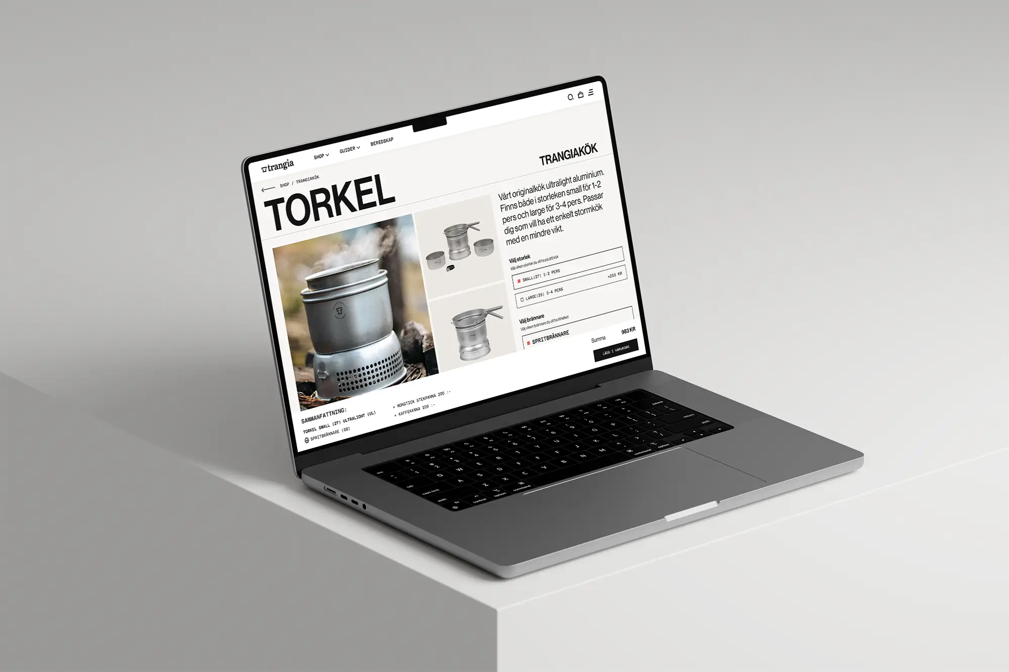
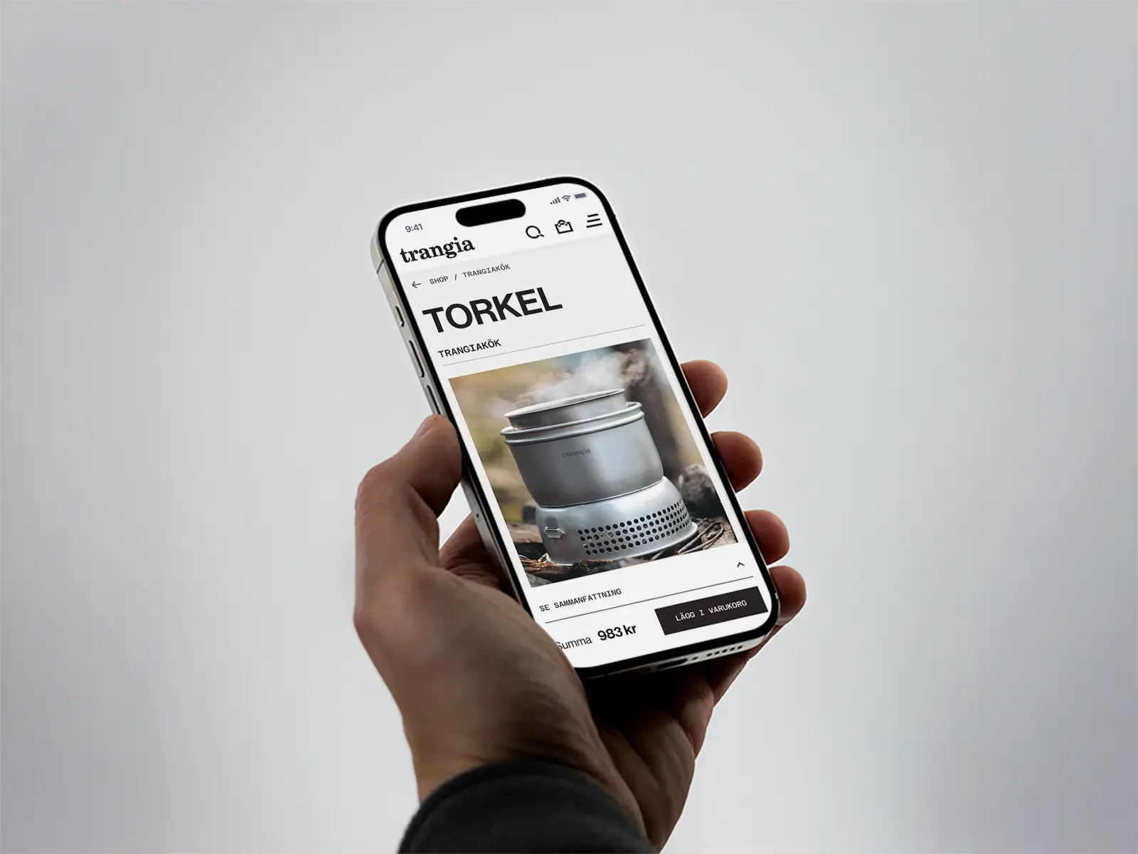
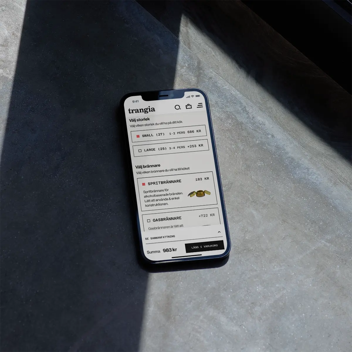
%%Simplified 50 product variations into 3 core kits%%, allowing users to customize size, burner type, and accessories
%%Redesigned the user flow%% to be more intuitive, guided, and easy to use
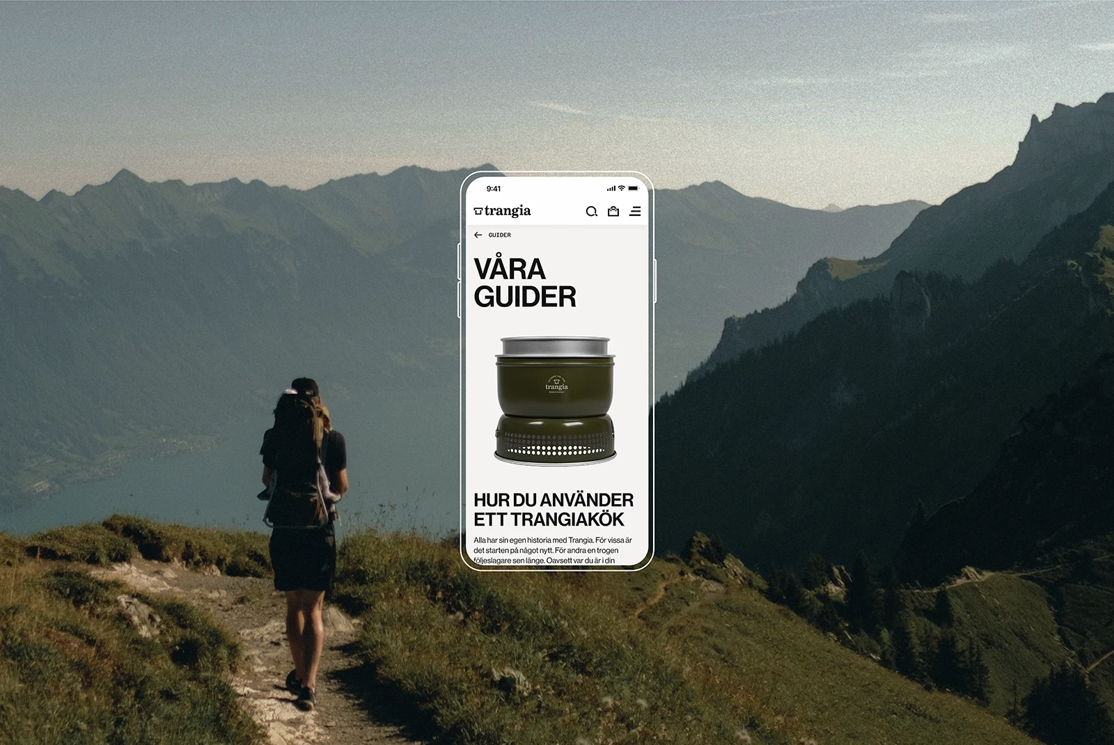
Created a %%digital step-by-step guide%%, later adapted into a physical instruction brochure
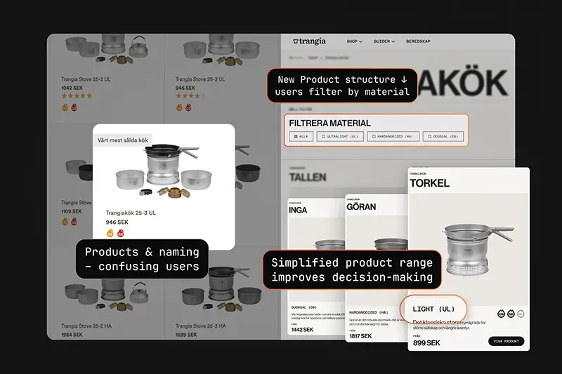
Instead of 50 variations with minor material differences, we created 3 core kits where the only difference is the material. After selecting a product, users can choose the size of the stove, burner type, and add accessories that match their chosen stove.
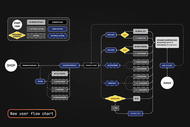
This new product structure enabled a clearer, more intuitive user flow that made decision-making easier and more guided.
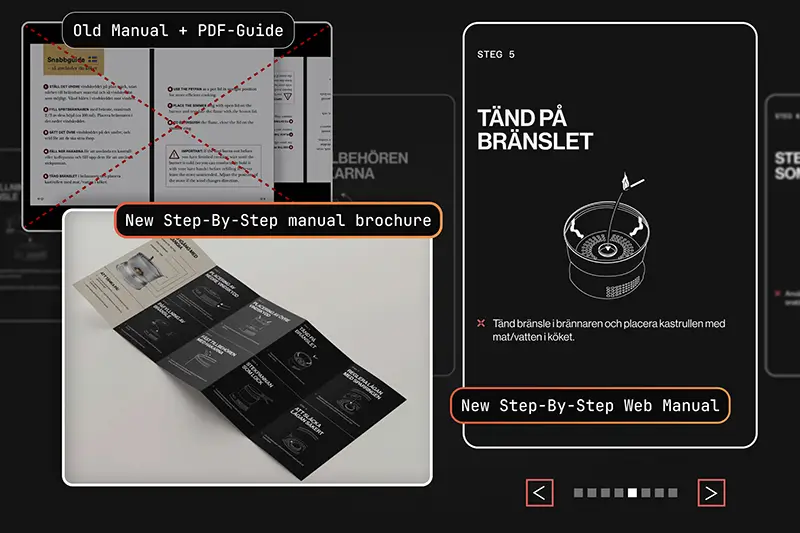
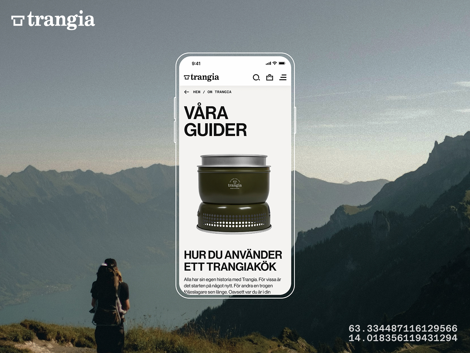
The old site had a text-based product guide that didn’t satisfy the Preppers needs. We created a new Guide-page with a digital step-by-step guide - illustrated by Nathalie and designed by me. Lina later adapted the layout into a physical brochure for the packaging which Juno then printed out.
Materialize/
Trangia
Test | Implement
Final testing & implementation outcomes
Final user testing revealed key improvements, resulting in a smoother and more engaging experience for both new and experienced users.
%%A/B testing%% shows that the %%new user flow improved decision-making%% and gave users more control
An %%unwanted behavior%% during testing led us to add images for accessories, which %%resolved the issue%%
3D model of the "century design" stove %%enhanced visualization and interactivity%%
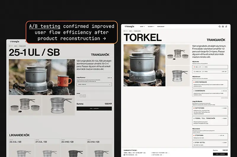
A/B testing showed a significant improvement in decision-making time with the new user flow, which gave users a clearer overview of what they were buying and what they needed.
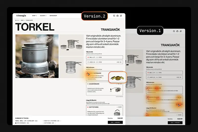
During user testing, I noticed an interesting behavior: some Preppers attempted to double-click or hover over accessory titles. This insight led us to add accessory images, which immediately solved the issue.
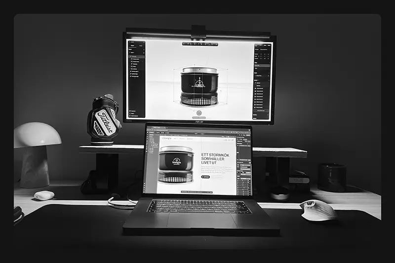
Our team worked efficiently, giving us time to focus on details. With Trangia celebrating 100 years with limited edition stoves, we decided to use 3D to make the website more interactive and purposeful. I created a 3D model of the "century design" stove in Spline, helping new users visualize the product while highlighting the limited edition color for experienced users.
Insights/
Trangia
Key insights
This was my first e-commerce project, and I loved it. My biggest takeaway is how crucial UX and UI are in e-commerce - and how even %%small user behaviors can reveal opportunities to clarify, guide, and improve the overall experience.%%
End of case
More Cases/
2025