Intro/
LTPC
This is some text inside of a div block.
Brief
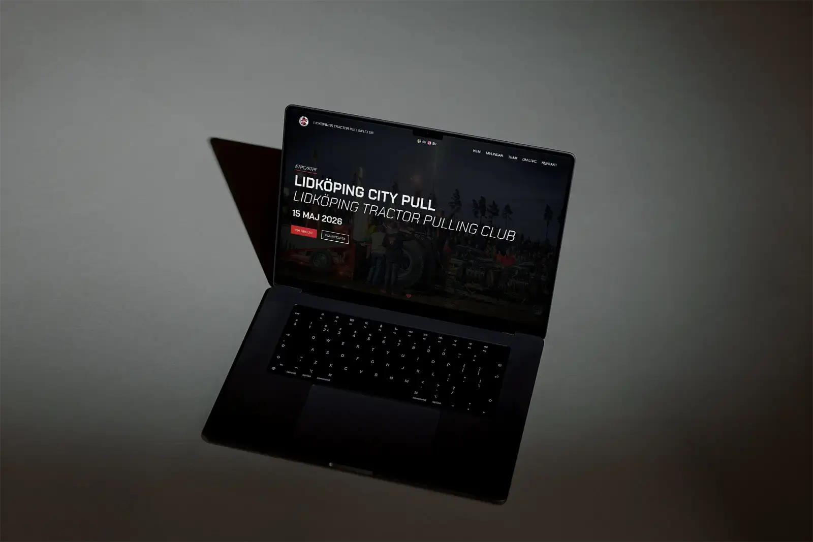
Lidköping Tractor Pulling Club (LTPC), one of Europe’s largest tractor pulling hosts, is looking to grow its digital presence. Their current website is outdated and no longer meets today’s usability standards. LTPC needs a platform that serves both local and international fans and teams - offering clear event information, contest statistics, and a high-energy experience that captures the loud-engine, rock’n’roll atmosphere of their events.
My role
This was a freelance project with quite short time period, I did everything myself from research, UX/UI to development of the website in Wix Studio to meet client needs. With a tight deadline I got to tighten my proccess aswell.
Year
2026
Duration
6 weeks
Project type
Freelance
Client
Lidköping Tractor Pulling Club
Scope
UX/UI Design
Wix.Development
Branding
Role
UX/UI Designer
Web-Developer
Team
Johan Pettersson
Understand/
LTPC
Emphatize
Understanding motorsport fans and event visitors
With limited time and minimal prior knowledge of motorsport, I focused on uncovering what fans truly need and expect from the website.
Ran stakeholder workshop to define event identity and digital goals
%%Evaluated%% the existing website, identifying issues
Conducted a user survey to %%identify digital needs and frustrations%%
During the client workshop, we uncovered a need for quickly scannable information and online access to the Event Program and Live Standing Sheet. The client want the event experience to be present at the website. When I asked them to describe the event they said: ”high-energy, motorsport experience with loud, screaming fans”.
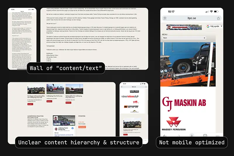
The website review exposed several usability problems as you can expect from an older website: lacking mobile responsiveness, unclear information architecture, and long text blocks that buried key details. However, much of the copy was still valuable and reusable.
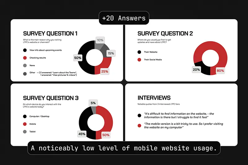
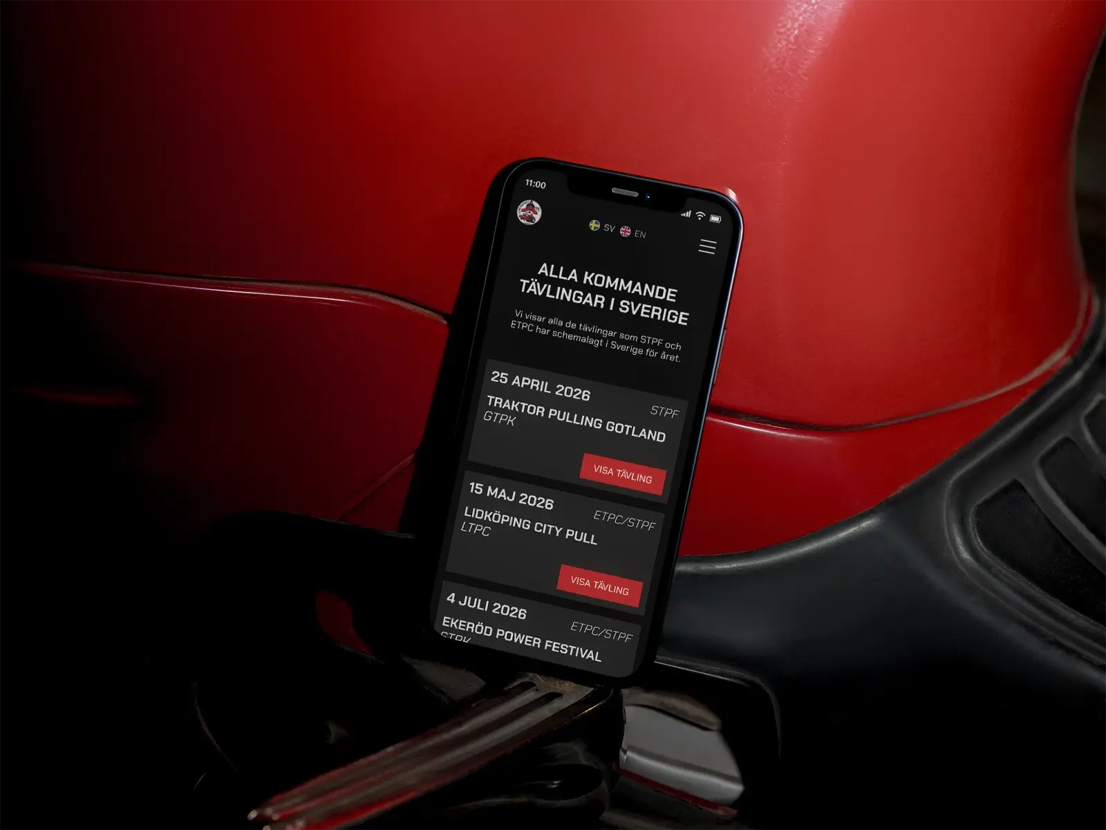
The user survey confirmed that visitors prioritize upcoming events, news, and practical details, often checking LTPC’s Facebook feed for updates. Frustration with mobile usability was a common pain point.
Define
Turning research into clear user needs
By synthesizing insights through affinity mapping, I translated user feedback and business goals into a clear problem statement and defined the core needs that would guide the design direction.
%%Users need fast access%% to event dates, schedules, and key information
Content must be %%easy to scan%% with a clear hierarchy
Website visuals should mirror the high-energy “rock concert” experience at LTPC events
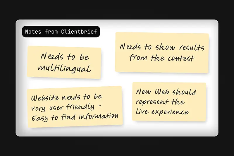
Identified technical needs: %%multilingual content, a Live-Result integration, improved content structure%%
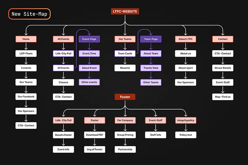
The existing website suffered from poor hierarchy and text-heavy layouts, creating friction and making important information difficult to find, -especially on mobile. I structured a new site-map and identified copy that needed rewriting to improve clarity and accessibility.
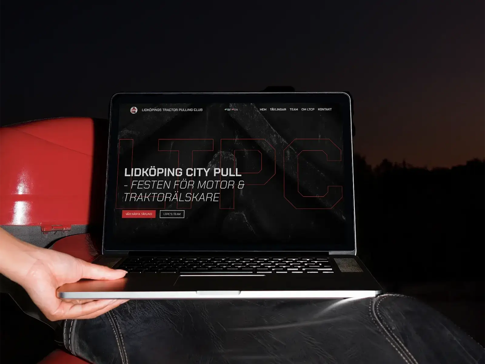
To define the site's visual direction, I put together a moodboard based on interviews with the client and visitors. The overall theme was summarized as a rock concert experience, which I presented alongside a high-fidelity homepage concept. The client immediately aligned with the idea.
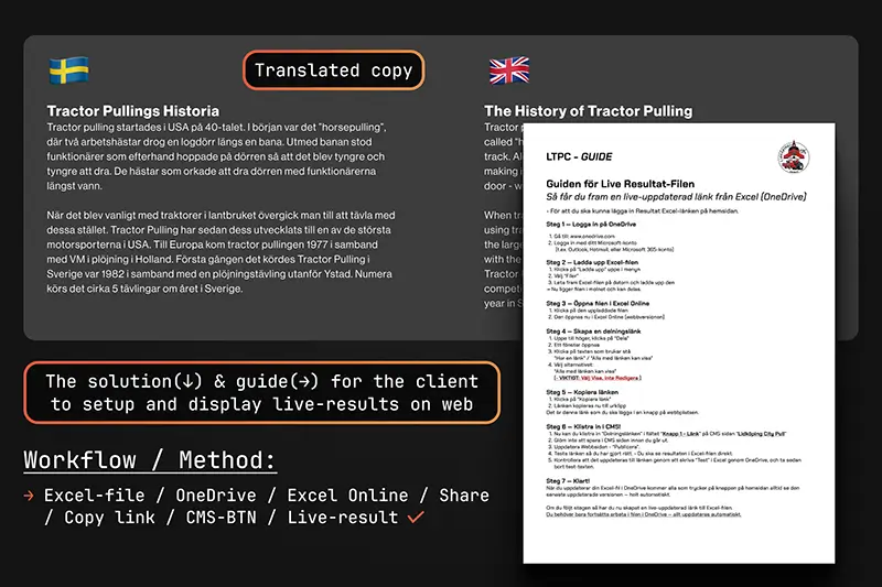
Since event participants and fans extend across Scandinavia, Europe, and the US, the website also required English language translation to meet international expectations. The European Tractor Pulling Commitee (ETPC) requires their organizers to display live results on their websites.
Explore/
LTPC
Ideate | Prototype
From structure to experience
I explored different layout structures for clarity, created Hi-Fi wireframes, and developed a lite visual identity that merges clarity with the “rock concert” atmosphere LTPC requested.
Restructured long text into %%scannable content components%%
Designed a new %%information architecture with clear hierarchy%%
%%Created CMS structure%% and designed page layouts
Developed a lightweight visual identity to %%translate the event to the website%%
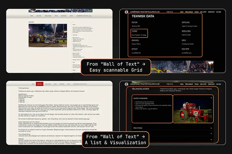
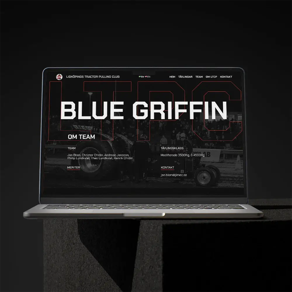
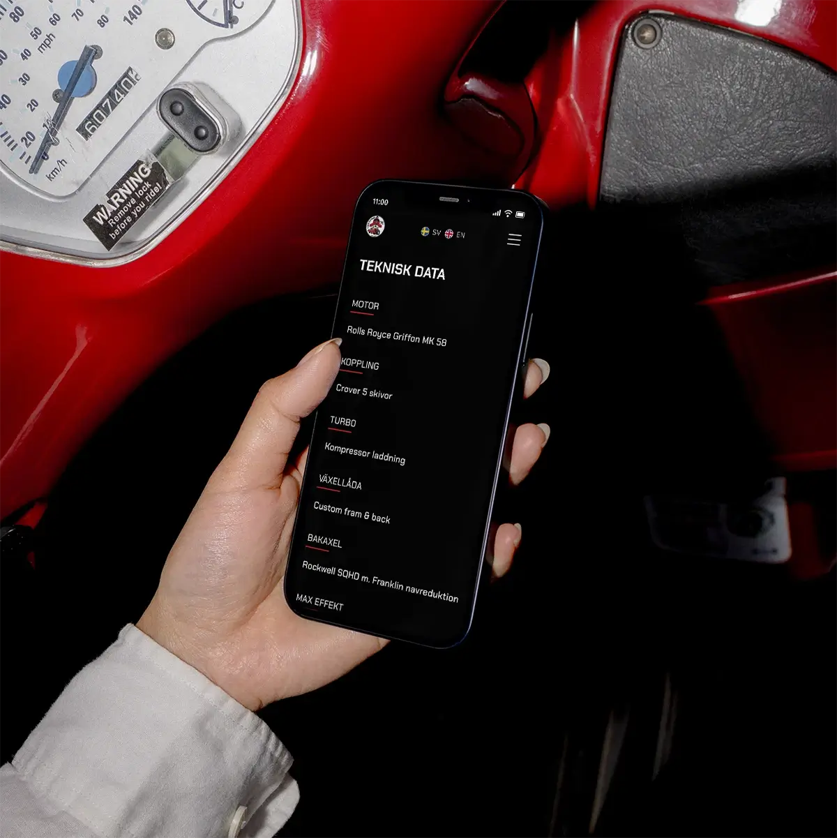
Improving readability was a major focus. I transformed the “wall of text” sections into modular components, ensuring users could scan statistics, team details, and event information quickly - while getting more SEO-opportunities.
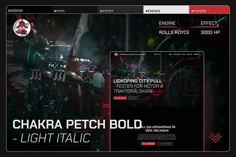
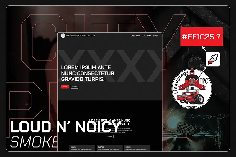
LTPC lacked a defined visual identity, beyond an existing logo and a preference for the color red. With a tight timeline, I created a lite visual identity- with a motorsport-inspired typeface, a red highlight color for navigation cues, and a dark color theme. I also applied a gritty, “rock concert” editing style to imagery to lift the raw, dirty and high-intensity feel of tractor pulling.
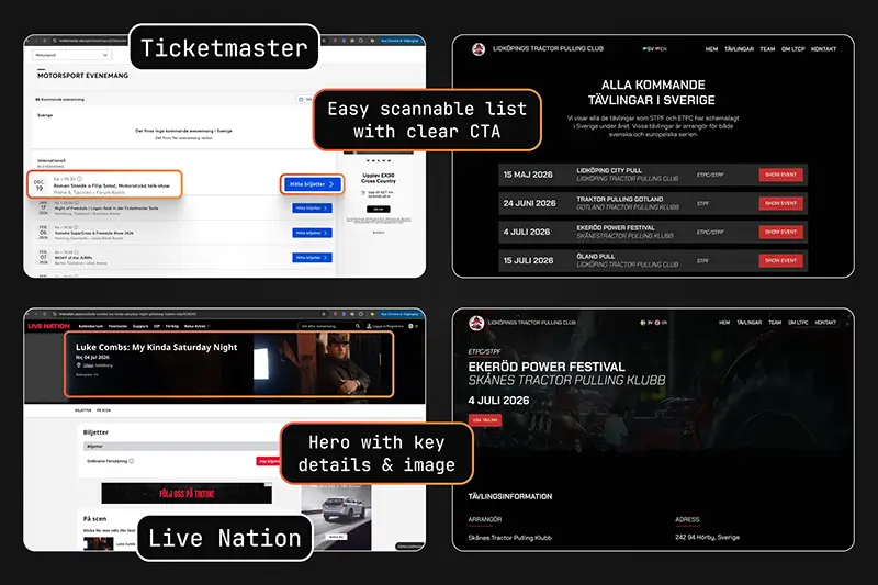
I explored a couple Event-Websites to evaluate sections visual clearity and scannable solutions. After some inspiration I started sketching out quick layout explorations to test different ways of organizing information and content.
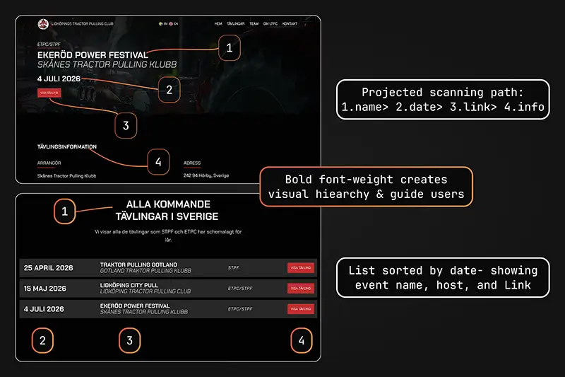
To establish a clear hierarchy without overwhelming users, I first experimented with oversized, bold headings but found they disrupted layout balance. Moving to dark mode solved this: contrast, scale, and proportions guided attention naturally, creating a layout that was more dynamic, more readable. Darkmode aligned well with the Rock Concert vibe and the moodboard.
Materialize/
LTPC
Test | Implement
Validating usability and delivering the final experience
With a limited timeline, I focused on lightweight usability testing, iterative refinements, and a smooth handover so LTPC could confidently manage and maintain their new website.
Finalized CMS structure, added real content, and %%wrote editor instructions%%
Ran %%“guerrilla usability tests”%% with 5 participants to validate navigation and key flows
Fixed SEO fundamentals, improved color grading, %%optimized images, and ensured compliance with accessibility standards (WCAG).%%
Delivered %%client onboarding for CMS use and website management%%
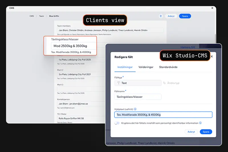
I connected all data collections to the CMS and replaced placeholder content with finalized material. To ensure sustainable ownership, I documented field-by-field editor instructions so LTPC could easily update content without external support.
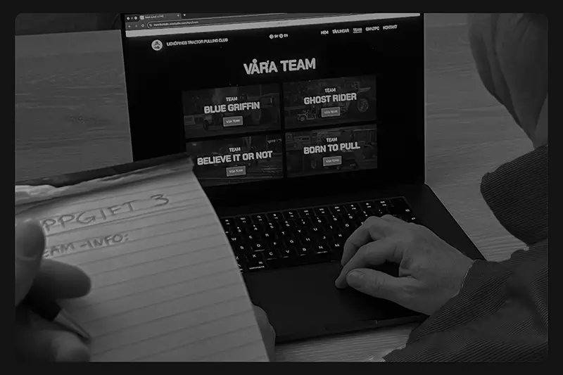
With just over 2 weeks before launch, I conducted informal usability tests with five participants. Each completed four key tasks - finding event information, navigating to team details, change language and locating standings - to verify that the most common user journeys were intuitive and friction-free.
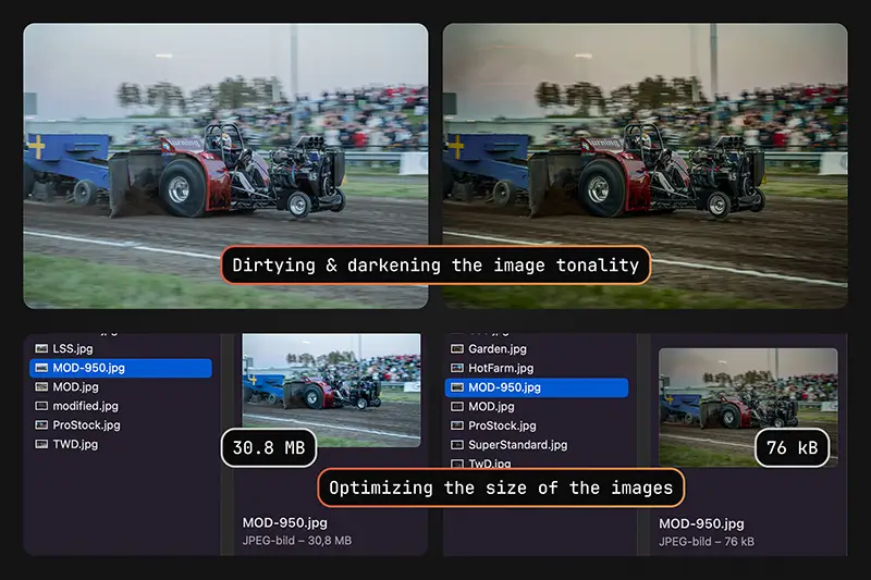
In the final week, I finalized the SEO foundations, including AI-assisted page titles and meta descriptions, alt text, image optimization, color grading, and a final accessibility compliance check (WCAG).
Insights/
LTPC
Key insights
This project was fast-paced and required a more condensed way of thinking. I had to be selective with my methods and plan the process carefully. %%I’ve learned that I can perform under tight deadlines and that taking some time to plan out my process is very important for tighter deadlines.%%
End of case
More Cases/
2026